
Helping Dyslexics ‘Unscramble’ Websites
Motivation
I rarely post about stuff I build. Honestly, I think it’s because I’ve been building so much. I made an exception for the below because I think it’s a good use case for others. This was a quick weekend project that had a big difference and I hope to inspire others down that path.
Update: 1-28-2015
I’m ecstatic that there have been over 2,000 downloads! A few people even found me and messaged me on Facebook to tell me how much it helped them. I didn’t realize such a quick project could make such a big difference
Update: 5-12-2017
Wow, over 8,000 users on the app!
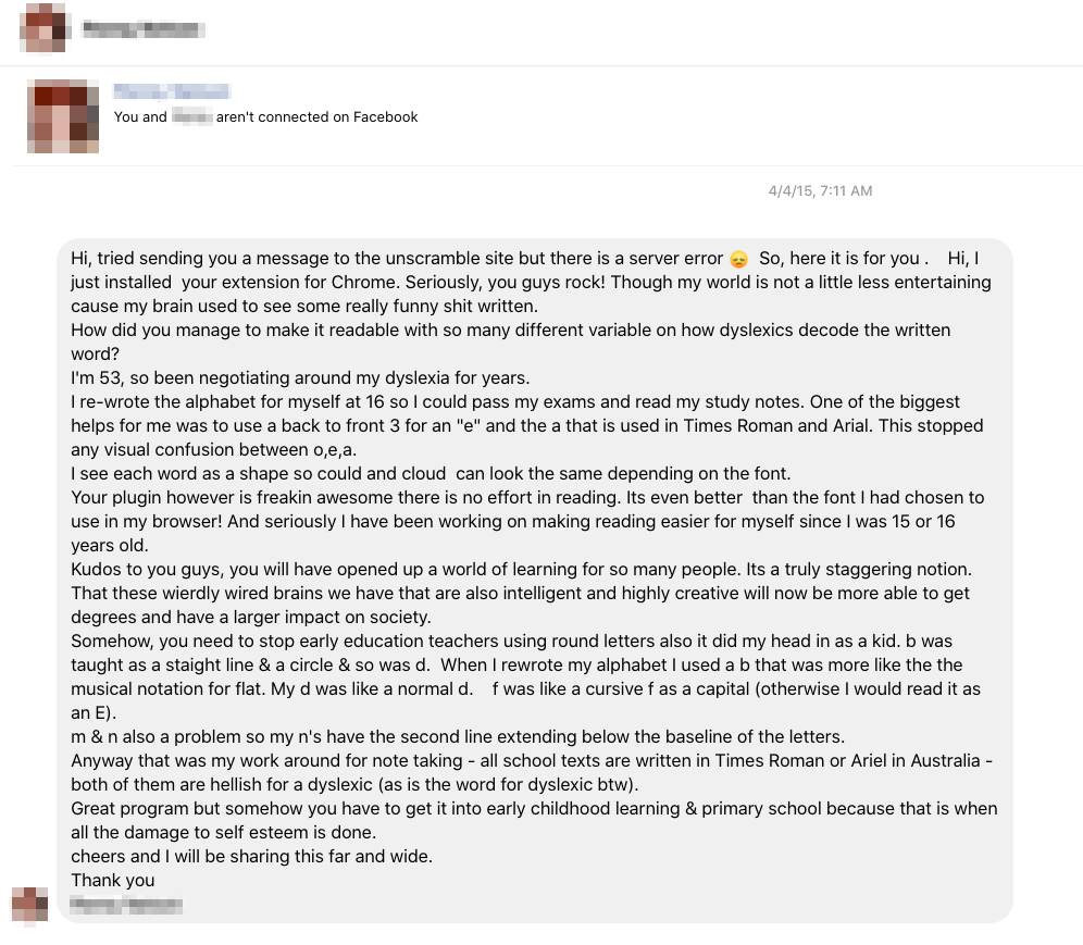
 Also, I just noticed I received a wonderful message a couple of years ago (redacted below) that I missed. Although I’m not actively maintaining the project anymore, I hope someone will build something similar, it’s still fantastic to know this mini weekend project helped so many people. The healthcare space is teeming with opportunities for positive innovation.
Update: 3-21-2018
Someone made another version based partially on the below research. I’m happy to say that their version is the one you should be using moving forward. I had no idea how much work it can be to maintain and respond to everyone so I’m happy someone is taking the reigns.
TLDR
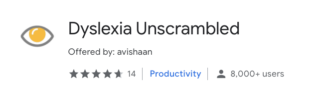
Unscrambled is a chrome extension that addresses various website design problems that make it difficult for dyslexics to read the text. It addresses more than other chrome extensions, is easier to use than most Chrome extensions, and requires no configuration. Unlike other extensions. Get it at the Google Chrome extension site here http://goo.gl/uJ5Gt4
Inspiration
I saw a video about a font that was made to help dyslexic people read easier and was inspired to do my take on it. I decided I would make a chrome extension, called Unscrambled, that would render the page using a font that makes it easier for dyslexic people to read as well as do some additional research on what other changes can be done to a website to make it easier.
I found all sorts of information on how to design a website to be easier to read and decided to incorporate those ideas into my Chrome extension. This means if the author of the website didn’t follow (most do not) the best practices that would allow a dyslexic user to read a website easier, a user can still get a good user experience without having to depend on the website author.
Unscrambled is better than other Chrome extensions
- Unscrambled requires no configuration. Other extensions require a configuration step to pick things like font and style. Some even require some CSS/HTML knowledge.
- Unscrambled is single-click activation. Other extensions require you to go into a menu popup to enable/disable the app. This makes it hard to turn the extension off to appreciate the page design.
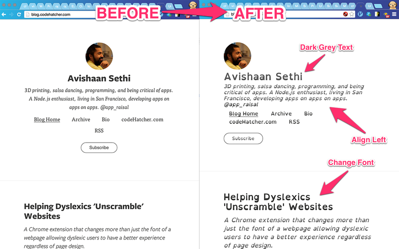
- Unscrambled does more than change the font. Other extensions only change the font. Unscrambled also changes the line height, line spacing, and contrast based on research cited below.
- Unscrambled is specific to your current tab, not browser wide. Other extensions change the font across all the tabs in the entire browser. We only enable it for individual tabs so you can only enable it for the tabs you need.
Research
Problems dyslexic users have with websites:
- Websites like google have a pure white background. This causes a ‘blur effect’.
- Black text should be made to grey to prevent the ‘blur effect’.
- Avoid green and red coloured fonts.
- Large distance between paragraphs can make it difficult to go from one paragraph to the next.
- Serif fonts which can obscure the shapes of the letters and cause a ‘washout effect’ for some users.
- Certain font styles cause letters to be the same just in different orientations such as d vs b. This can cause spatial confusion.
- Handwritten fonts cause confusion between “oa” and “oo” as well as “rn” and “m”.
- Short ascenders and descenders cause letters to look like their shorter/longer counterpart.
- Italics cause a ‘washout effect’
- Two spaces after a period cause ‘river effect’.
- Justified text causes a ‘river effect’ due to the inconsistent uneven spacing between letters and words.
- Centered text makes it difficult to get to understand where the next line is
- Large paragraphs and blocks of text can look intimidating and difficult to parse
Legend
River Effect - large gaps occur within consecutive lines of text, looks like a bunch of whitespace Blur Effect - text starts to swirl together in a radial-like pattern Washout Effect - text looks very faint and difficult to see
References
Text Configuration and the Impact of Anxiety on Pupils with Dyslexia. Procedia Computer Science, Volume 27: 130-137
Rello L, Baeza-Yates R. Optimal Colors to Improve Readability for people with Dyslexia. In: Text Customization for Readability Symposium Online Symposium. 2012. Retrieved September 10, 2013 http://www.w3.org/WAI/RD/2012/text-customization/r11.
Beth A. O’Brien. The effect of print size on reading speed in dyslexia. At http://www.ncbi.nlm.nih.gov/pmc/articles/PMC1427019/
Luz Rello. Text Customization for Readability Online Symposium. At http://www.w3.org/WAI/RD/2012/text-customization/r11